

apex:gaugeSeries and display report data
by Patrick Connelly posted on January 25, 2016
I recently helped out on a Developer Boards post about recreating a dashboard in Visualforce to create a home page component. This works great with analytics:reportChart assuming you are not using a gauge chart. However if you want to use a gauge chart then you’ll have to dive into the apex:gaugeSeries component and personally I found the documentation a bit lacking. So, let’s dive into how to create a gauge chart based on a summary report.
The Report
To do a proof of concept on this I made a very simple summary report that returned just the number of closed cases in my org.
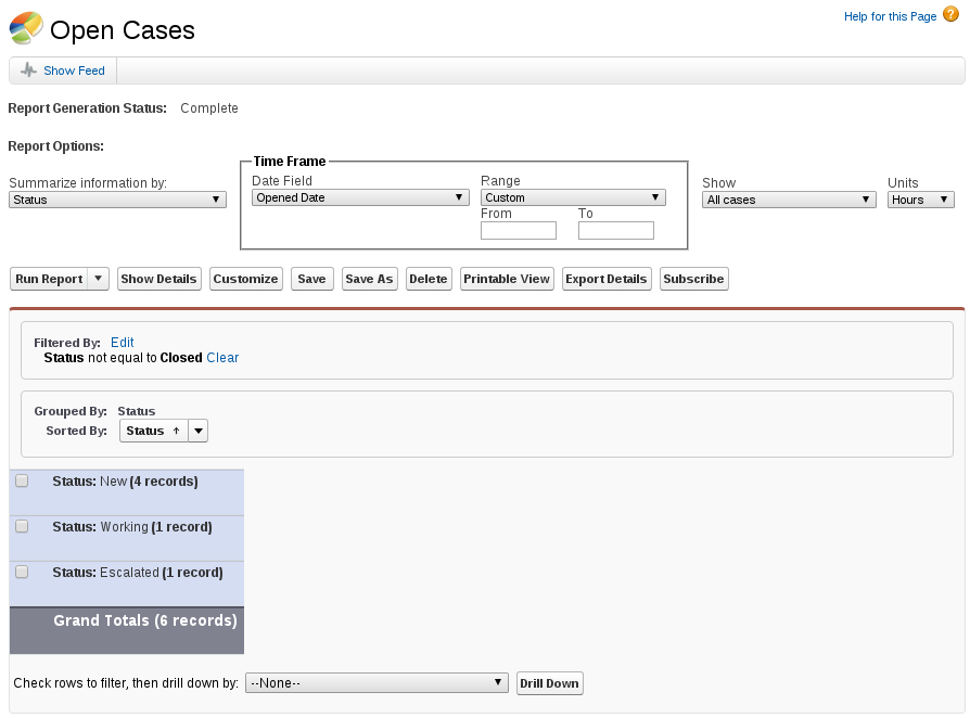
For the use of this report I grouped by Status, but it doesn’t really matter since the “Grand Totals” is what we’ll be using for our Visualforce apex:gaugeSeries.
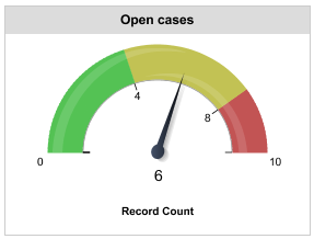
If we put a standard gauge chart in our dashboard for the Open Cases report, we get the following. For this we’ve simply customized the colors as well as our stop points of 4 for green, 8 for yellow and 10 being our default upper bounds.
The Code
The Controller
The first thing we need to do in our controller is to fetch the report and then get the grand total of the rows. Fortunately the Reports and Dashboards API makes this real easy. In fact, there’s a great article on how to get report data with it.
public class GaugeController {
    private static Integer LOWER = 4;
    private static Integer MID = 8;

    public String gaugeColor {
        get;
        set;
    }

    public class GaugeData {
        public String name {
            get;
            set;
        }

        public Integer size {
            get;
            set;
        }

        public GaugeData(String name, Integer size) {
            this.name = name;
            this.size = size;
        }
    }

    public List<GaugeData> data {
        get;
        set;
    }

    public GaugeController() {
        this.data = new List<GaugeData>();

        List<Report> reportList = [
            select Id
            from Report
            where DeveloperName = 'Open_Cases'
        ];

        Reports.ReportResults results = Reports.ReportManager.runReport((String) reportList.get(0).Id, true);
        Reports.Dimension dim = results.getGroupingsDown();

        Integer numberOfCases = 0;

        for (Reports.GroupingValue groupingVal : dim.getGroupings()) {
            String factMapKey = groupingVal.getKey() + '!T';
            Reports.ReportFactWithDetails factDetails = (Reports.ReportFactWithDetails)results.getFactMap().get(factMapKey);
            Reports.SummaryValue sumVal = factDetails.getAggregates()[0];
            numberOfCases += Integer.valueOf(sumVal.getLabel());
        }

        this.data.add(new GaugeData('Cases', numberOfCases));

        if (numberOfCases < LOWER) {
            this.gaugeColor = '#093, #ddd';
        } else if (numberOfCases < MID) {
            this.gaugeColor = '#ff6, #ddd';
        } else {
            this.gaugeColor = '#c00, #ddd';
        }
    }
}
In the code above do the following:
- Get our report Id by it’s Developer Name of Open_Cases
- Run the report
- Get all of the report groupings
- Iterate over each grouping
- Get the count of cases and add it the the running count
- Add the cases to a GaugeData class
- Set the display color based on the number of cases
NOTE: I would probably find a better way to do the report summing rather than iterating through all of the groupings, but I’ve not dived into the Reporting API before and this was the quickest way. Also, I would probably make the gaugeColor strings static and or mapped to make it more flexible.
Visualforce and apex:gaugeSeries usage
Now that we’ve got our data, we need to display it.
<apex:page controller="GaugeController">
    <apex:chart height="150" width="250" animate="true" legend="true" data="{!data}" theme="Salesforce">
        <apex:axis type="Gauge" position="gauge" margin="-10" minimum="0" maximum="10" steps="1"/>
        <apex:gaugeSeries dataField="size" highlight="true" tips="true" donut="25" colorSet="{!gaugeColor}">
            <apex:chartLabel display="over"/>
        </apex:gaugeSeries>
    </apex:chart>
</apex:page>
The key takeaways from this is that you set the data on the apex:chart component and then inside the apex:gaugeSeries you set the dataField that maps to your GaugeData class in your controller. If this does not match correctly, nothing will report failure, the gauge chart just will not display.
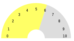
Now this gauge does not look nearly as pretty as the standard gauge. With some time and some elbow grease, I’m sure you could make it look a lot closer with some CSS and adjusting the apex:gaugeSeries / apex:chart / apex:axis variables.
Looking Forward
If I were to implement this in my actual org, I would do a couple of things different to enhance this gauge. First, I would move all of the Visualforce into a component. I would then pass in the report Id, the upper, mid and lower bounds as well as the colors associated with them and the background color. This way I could simply call the component for each report instead of having to code it out for each one.